
How do I read Payroll Payment Analytics?
How much did we actually pay employees this period, and how is that pay spread across the workforce?
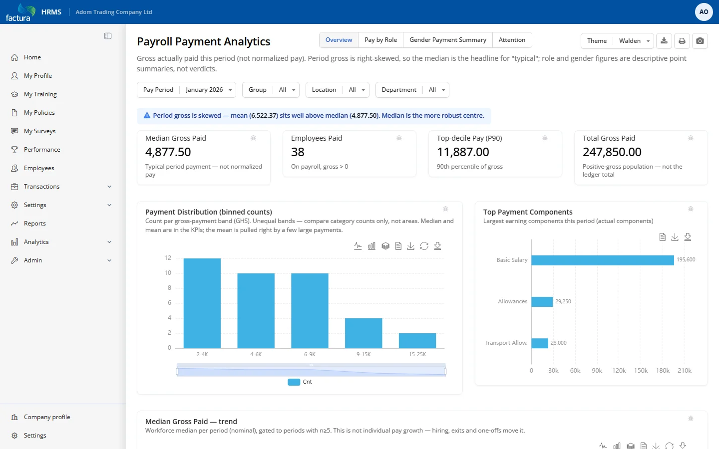
Who it's for: Payroll / HR managers reviewing a period's actual spend and spotting unusual payments. (Not market benchmarking — that's a planned v2.)
KPI tiles
- Median Gross Paid — the typical period payment (gross is right-skewed, so median beats mean).
- Employees Paid — count with gross > 0.
- Top-decile Pay (P90) — the 90th-percentile payment.
- Total Gross Paid — sum for the positive-gross population.
Charts & tables (by tab)
- Overview — Payment Distribution bar (counts per pay band; bands are unequal width — compare counts, not area); Top Payment Components; Median Gross trend (12 periods, only months with 5+ paid).
- Pay by Role — Median gross by role and by department, gated to n ≥ 5; a note counts roles suppressed below the floor. Reflects role mix, not a market benchmark.
- Gender Payment Summary — headcount, median, mean by recorded gender; descriptive, not a pay-equity verdict.
- Attention — count of payments above P90 "to review" (no names/amounts); coverage & data-gap notes; count of payments below GHS 600 flagged for review (not a minimum-wage test).
Filters & controls
- Period picker + Group / Location / Department multi-selects; four tabs; CSV export.
How to read it
- Trust the median over the mean — a badge appears when the mean runs high (a few big payments pull it up).
- Role / department / gender figures appear only at 5+ paid; no individual salary is shown.
- This is gross actually paid (basic + allowances + OT + bonus + back-pay), not FTE-normalised — it can't answer "is pay competitive."
- An "above P90" or "below GHS 600" flag isn't automatically wrong — verify against the person's baseline (could be arrears, terminal pay, or part-time).