
How do I read Diversity & Inclusion?
#analytics/diversity-representation · Workforce Representation & Pay Patterns
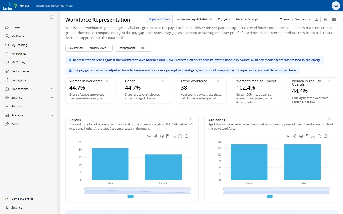
Who makes up the active workforce (gender, age), and where different groups sit in the pay distribution — described against the company's own baseline, not scored or ranked.
Who it's for: HR managers / leadership reviewing composition and pay-equity signals. Not a self-service employee view — protected-attribute data with built-in suppression.
KPI tiles
- Women in Workforce — female share of active employees (the baseline every other cut compares to, not 50%).
- Under 35 — share of active employees under 35.
- Active Workforce — total active headcount for the filters.
- Women's median ÷ men's — women's median pay as a % of men's; below 100% = a gap against women (unadjusted).
- Women in Top Pay Quartile — female share of the highest-paid quarter, read against the workforce baseline.
Charts & tables (by tab)
- Representation — Gender donut; Age bands bar; Gender mix by department grid (% women, n ≥ 5).
- Position in pay distribution — Women's share by pay quartile (Q1 low → Q4 high); the signature chart — shows where women sit, not seniority. Shown only with 20+ paid, each cell n ≥ 5.
- Pay gaps — Median pay by gender (each gender at n ≥ 10); labelled unadjusted.
- Fairness & scope — a "what this is / is not" table plus the privacy-methodology panel.
Filters & controls
- Period picker + Department multi-select; four tabs; CSV export; About panel with methodology.
How to read it
- Every percentage is benchmarked against this company's own mix, never a 50/50 target.
- Pay figures are unadjusted (no control for role, tenure, hours) — a gap is a signal to investigate, not proof.
- Small numbers are dropped by design — the pay tabs disable entirely under 20 paid; widen the department filter or pick a fully-processed period if a tab looks empty.
- No "diversity score," no ranking, no seniority cut — pay quartile is a neutral stand-in for "position."